
Shell Chess
Spearheading the creative direction and roll out for the social media branding of Shell Chess
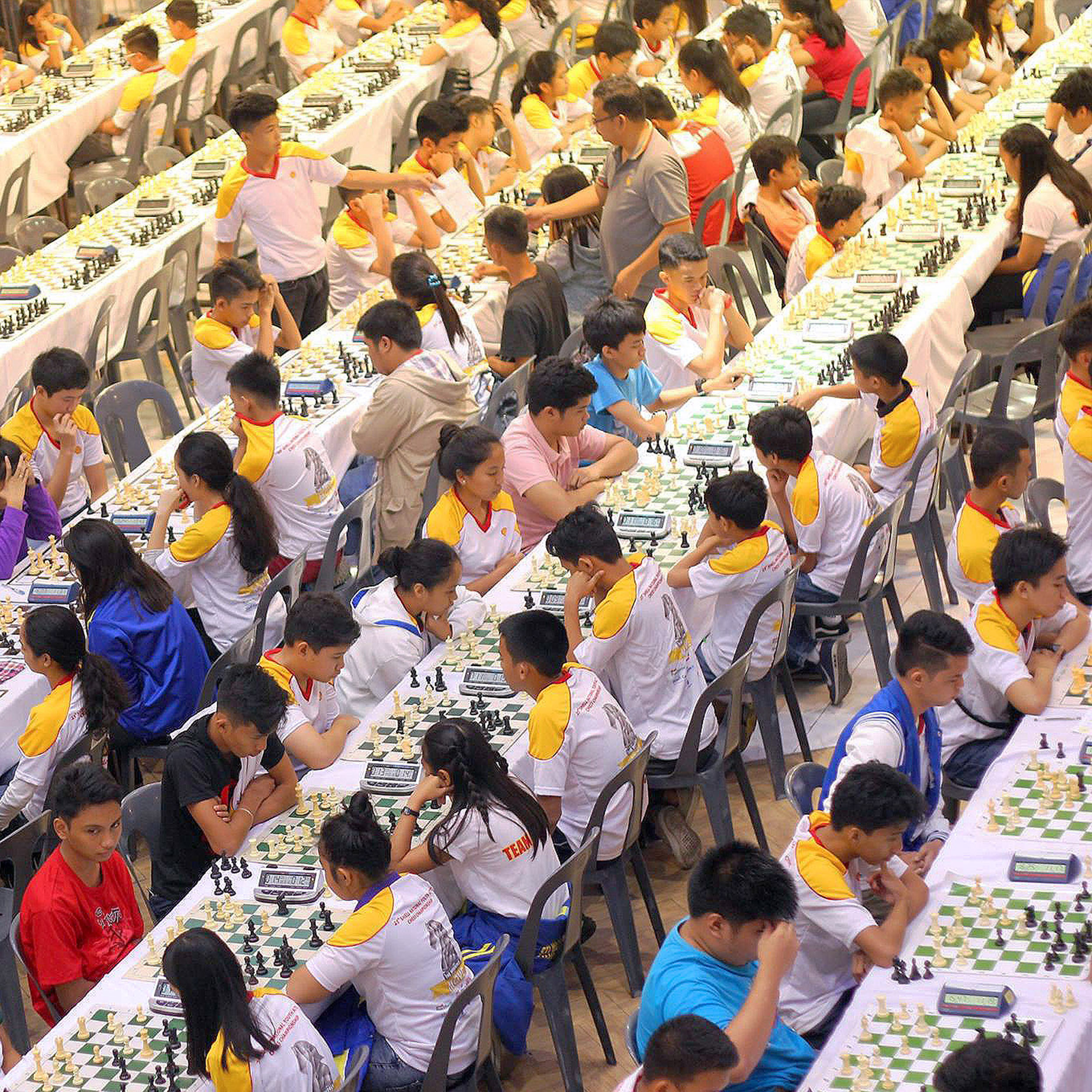
One of Shell Philippines' flagship social investment programs is the Shell National Youth Active Chess Championships. Known as the country’s longest-running chess youth competition, it geared up for its 25th edition with a new breed of talents, and its first brand presence in social media.
Creative Lead

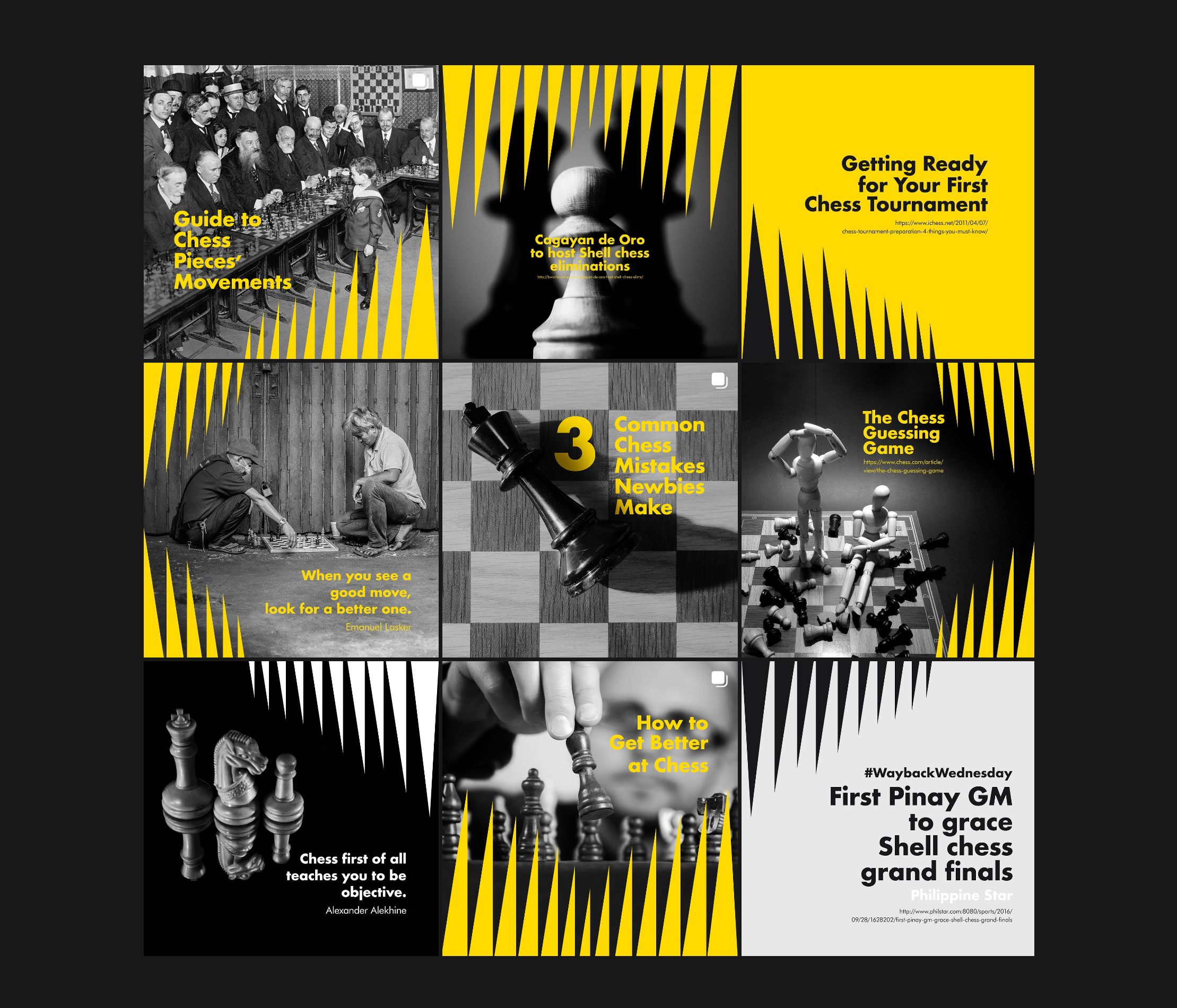
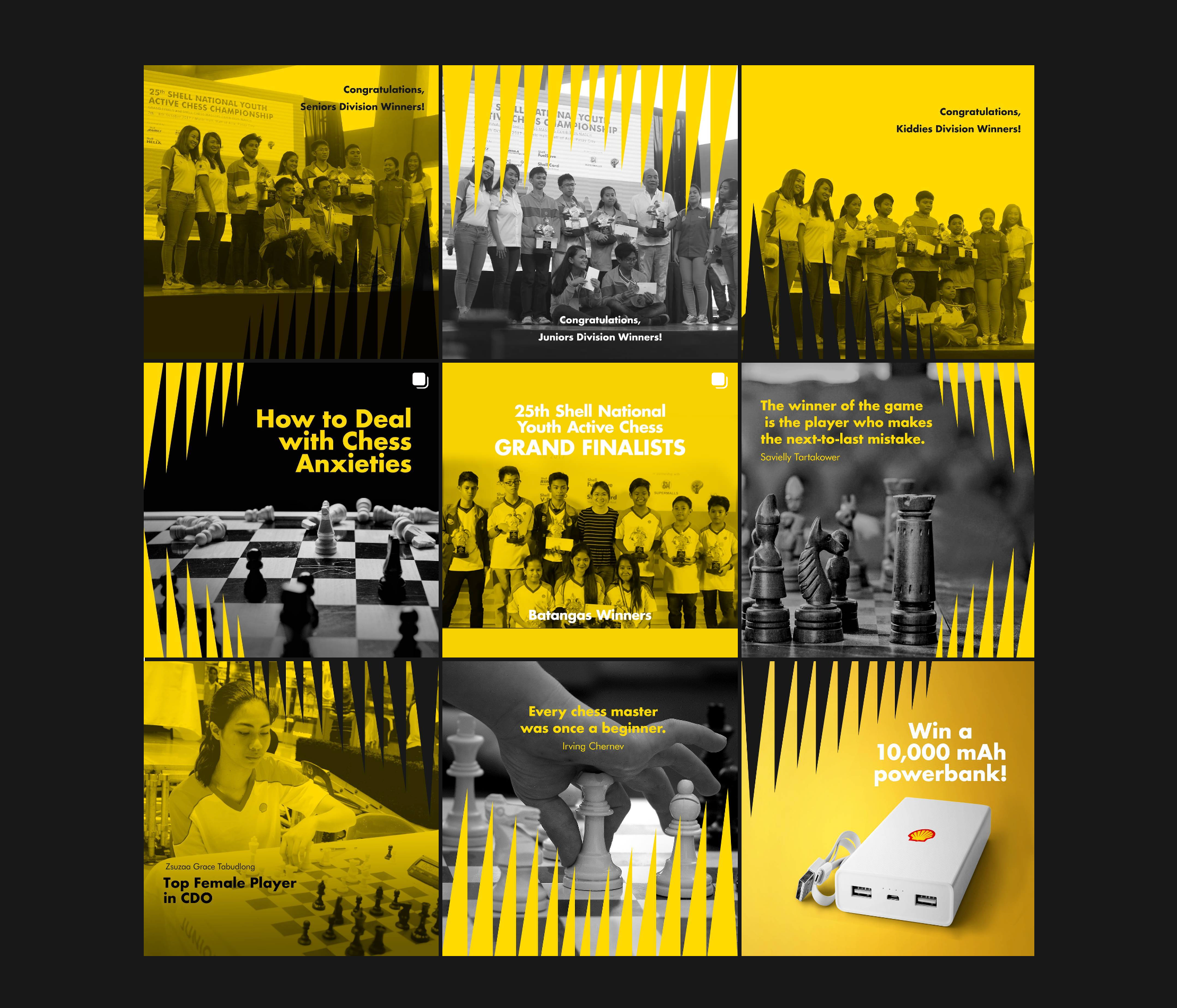
I developed and implemented the social media branding and its assets, starting with the logo and its key visual, which embellish the borders of its social media posts. I designed the logo by taking inspiration from one of the more iconic chess pieces in the game, the Knight. I made the strokes of the horse's silhouette pointed, with the mane of the horse to look angular, like spikes. In turn, the spikes in the mane served as the main key visual of the brand design. The spikes show across all the posts, lining up the borders to form a 9-grid polyptych, a 9-grid aesthetic. This creates an impactful and cohesive look for the feed.
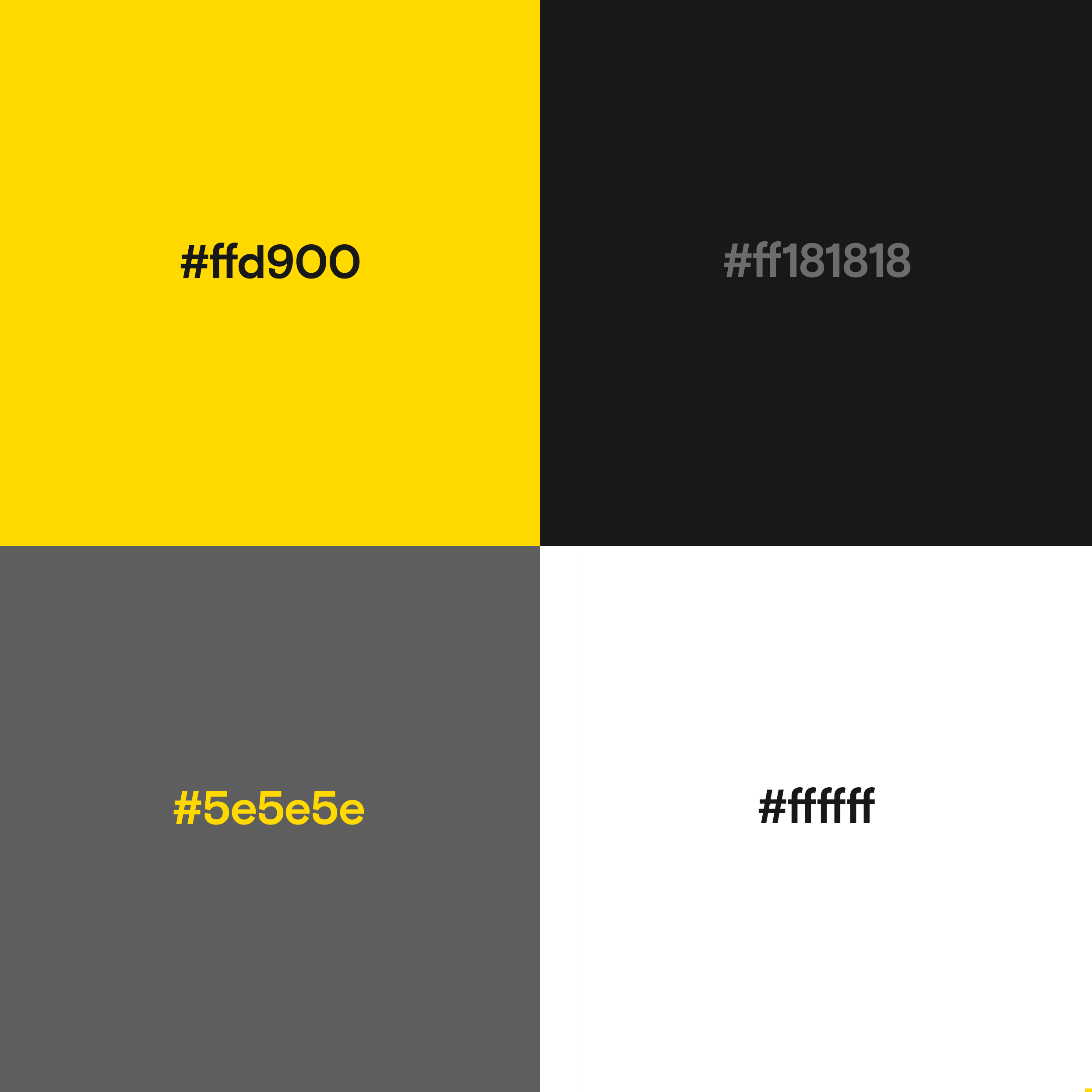
The photos used for the feed are all in black and white, to form the color palette of greys, blacks, whites and yellow that permeates the feed, which serves as the branding colors.
Instagram: @pinoyactivechess


Creative Lead
I developed and implemented the social media branding and its assets, starting with the logo and its key visual, which embellish the borders of its social media posts. I designed the logo by taking inspiration from one of the more iconic chess pieces in the game, the Knight. I made the strokes of the horse's silhouette pointed, with the mane of the horse to look angular, like spikes. In turn, the spikes in the mane served as the main key visual of the brand design. The spikes show across all the posts, lining up the borders to form a 9-grid polyptych, a 9-grid aesthetic. This creates an impactful and cohesive look for the feed.
The photos used for the feed are all in black and white, to form the color palette of greys, blacks, whites and yellow that permeates the feed, which serves as the branding colors.
Instagram: @pinoyactivechess
